OTP celebrates these barrel-scraping examples of kit design
1. Everton away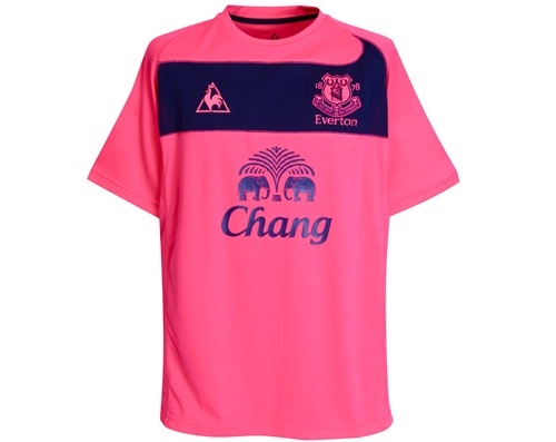
If last season’s black with pink pinstripes away kit was controversial, Everton’s new away kit is downright offensive. Whether the Toffees are attempting to market their kits as his and hers rather than home and away we cannot confirm. But we do know that it will be a very brave Evertonian who dons this for away matches.
2. Chelsea third kit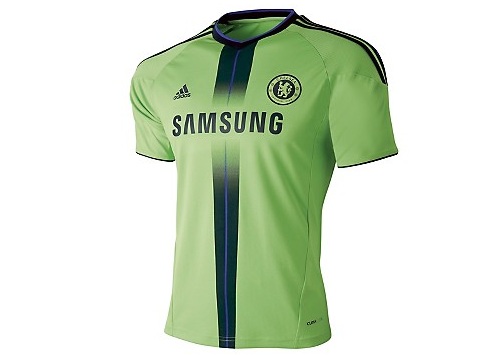
This snot-inspired effort looks like Adidas let the work experience boy loose with a fluorescent colour palette and a brief introduction to using gradients. Said work experience boy also managed to work his school tie into the design.
3. Fulham away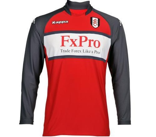
Just a horrible, horrible kit. Everything about it is wrong: the wet shine of the black sleeves, the way it looks like the sponsors logo was stuck on as an afterthought, and the dubious design. Fulham have had nice red and black away kits in the past. This Kappa effort is not one of them.
4. Blackpool home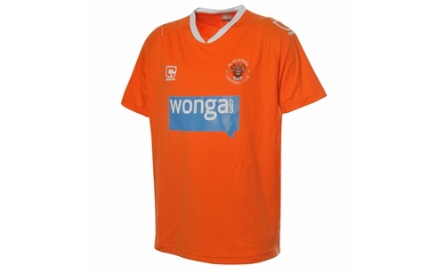
We don’t have a big problem with the colour, but it is manufactured by Carbrini and sponsored by Wonga.com. If this kit was a person it would think a trip to McDonald’s was an evening out and probably be fiddling its benefits.
5. Chelsea away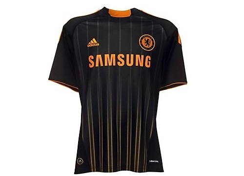
Oh no! The work experience boy’s been at it again with his fluorescents and gradients as Chelsea manage two kits in the top five. You could argue Adidas’ decision to put Chelsea in orange after their infamous orange-and-graphite monstrosity of the late-1990s is brave. Or you could argue it is stupid.


